Canned Drink Advertisements
In this document I will talk about different drink can advertisements and analyze them to see why they are effective and how they cater towards their target audience. I deliberately chose advertisements that had some sort of resemblance to how my advertisement will look so I can expand my market knowledge and take inspiration for my advertisement.
Advertisement 1
Font: Serif
Font Personality: Bubbly, bold and friendly.
Demographic/Target audience: Younger audience. Children and teens or people who want to be healthier. Specifically women.
This advertisement uses a lot of pink throughout the ad, implying that it is targeted at women. The advertisement uses a bubbly serif font, promoting it as positive and friendly. The drink seems to be advertised towards young women aged 18 - 32; with a cute and colourful can, bubbly and enthusiastic font, and health information at the bottom, it is clear to see that Poppi are directing their advertisements to young women who are healthy.
Poppi wants to portray their drink as a healthy alternate to fizzy pop that is still filled with flavour of the sugary brands, the bright colours make you think that the drink must have a lot of flavour because it isn't plain or bland.
The advertisement has a very simplistic design with no intense or eye catching graphics and instead uses vibrant colours to grab the attention of the viewer. The nutritional information at the bottom paired with the cute can will most likely intrigue Poppi's target audience of young women interested in health and who want a healthy substitute to unhealthy fizzy drinks.
Advertisement 2
Font: Sans Serif
Font Personality: Modern, simplistic.
Demographic/Target audience: Teens, young adults and adults. Both genders. Quite a cool and modern design and the whole marketing design is about the future so I'd say it appeals to more young and modern generations like 14 - 30.
The advertisement uses a lot of pink and blue in the advertisement which enforces the idea that the product is catered towards both males and females. By using the two most common colours related to boys and girls the Coca Cola ad makes it clear that the product is not gender specific. The sans serif font is very simplistic, plain and modern. It is easy to read and supports the futuristic message coke is portraying since it is modern and plain.
The advertisement grabs the attention of the consumer with the unique graphic design which perfectly portrays the futuristic style that Coca Cola were going for with this ad. The graphic of this advertisement is more intricate than the other two I have analyzed in this document, perhaps this is to successfully convey the futuristic atmosphere Coca Cola were aiming for to the audience, they want you to see this ad and see this drink as a pioneer for the future; using AI to co-create a drink or an add is something that has not really been seen before in the drink industry and Coca Cola are pioneering this new idea.
Advertisement 3
Font: Serif
Font Personality: Bubbly and friendly.
Demographic/Target audience: Adults because it is a alcoholic beverage. Young adults because it is friendly and social. Catered towards women.
This is the advertisement for a canned alcoholic beverage. The pink background and red can make it seems like it is targeted towards women because pink usually attracts girls to a product. The pastel colours and bubbly font connote that the drink is friendly and sociable. It portrays itself as a friendly, happy drink that you can sit and drink with your friends and they used the font to convey this happy message.
This advertisement creates a brand identity for the drink: a friendly, positive and sociable alcoholic drink that is catered towards females due to the colours and fonts used in the advertisement. The text 'It's punchtime' is catchy and something that consumers can correlate to the brand as the product is called punch, they will think of the catchy slogan and then think of the drink.
It is a very simple advertisement and this is deliberate, it is not supposed to be a very detailed and quirky advertisement. It's meant to be casual and get the message across that its a simple, friendly and tasty drink with information they want you to know to persuade you to buy it like how its made with real fruit and its gluten free.
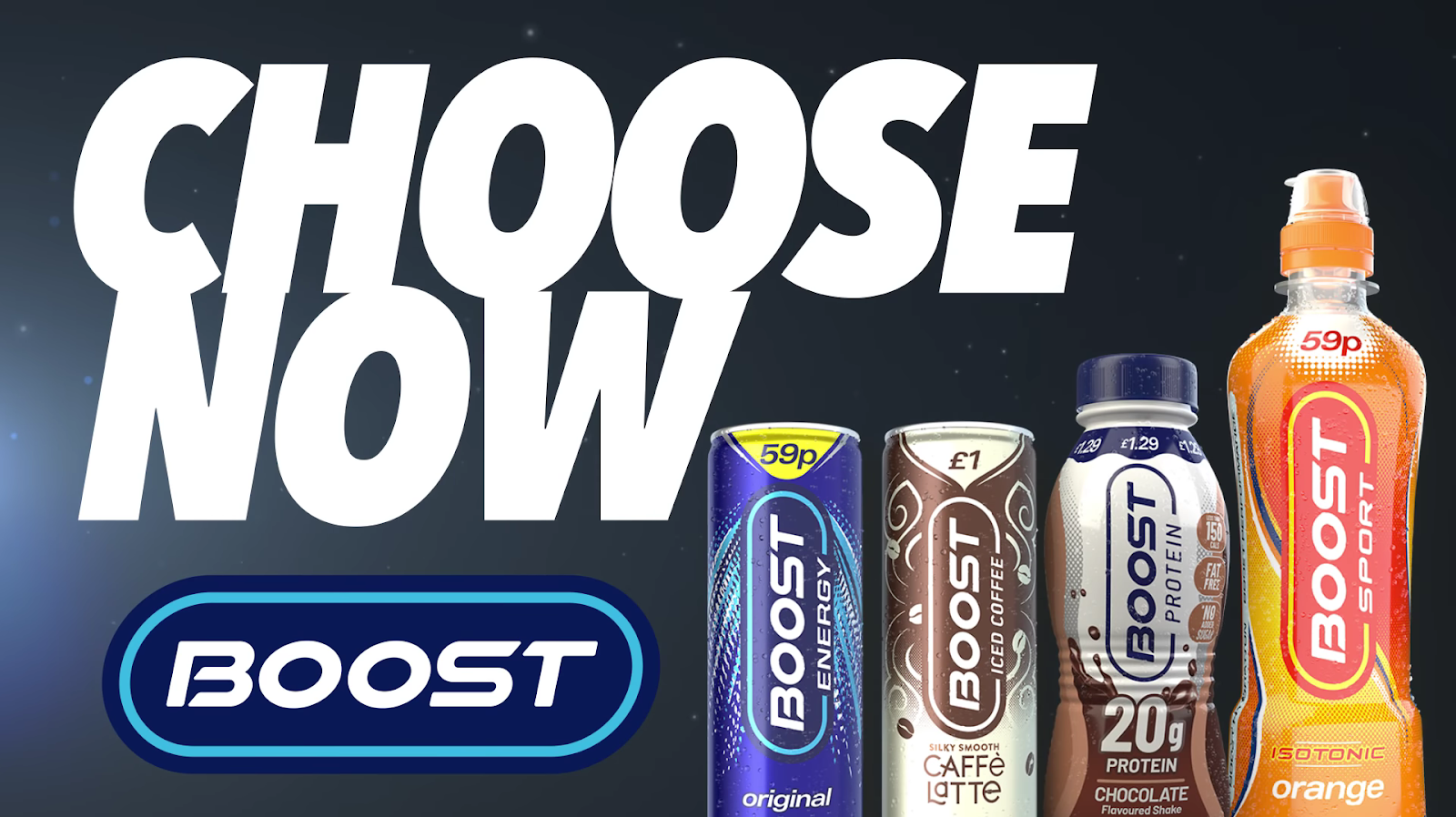
Video Advertisement
Boost Drinks - Choose Now TV Ad (30s) - YouTube
This is a very hyperactive ad that Boost uploaded onto their YouTube to advertise a range of their Boost energy drinks. The advertisement is trying to tell the viewers that Boost is an effective energy drink that amplifies your productiveness in any activity as seen in the ad; multiple people can be seen excelling at different activities like football, exercising, completing work, gaming and creating music after drinking Boost. Boost is trying to tell its audience that this energy drink will help you no matter what you are doing.
The target audience for this ad is quite broad as in the video it features different hobbies and different professions excelling in what they are doing after therefore the advertisement is targeted towards both females and males however I would say the ad is more catered towards young adults who are active (18-30).
The font used at the end of the ad is a big and bold sans serif font. Each letter is close together and the text is slightly italic to portray movement which further enhances the point that boost are trying to advertise their drink products as energetic and an efficient boost to any activity, making you faster whatever you're doing.
What I have learnt from this research
From this market research on drink advertisements, it helped me formulate and progress with my idea, due to looking at other successful advertisements I am more knowledgeable on what makes a drink advert successful and what exactly draws in customers. Looking at advertisements with different target audiences helps me understand how to cater my own advert to my desired target audience as that is what makes your advert so successful; I need to know exactly who I want to promote my drink towards and how to promote it to them and this research has assisted me in this area as I now know exactly how to draw in my target audience.
Print Advertisement
This is a test image for my print advertisement, this will be expanded on in the future to create a much more detailed and professional design. However, this does provide a rough insight into how the final print advertisement may look.
Production Schedule
The proposed launch date for my campaign is the 1st of February. This is because it gives me time after I have finished all the tasks to ensure that the campaign is suitable to be released to the public.


Comments
Post a Comment