D2
Introduction
In this report, I will discuss how I have met the brief throughout my work. I will discuss in depth about the technical aspects and the aesthetic aspects of the work I created for my energy drink brand. Additionally, I will thoroughly evaluate how effective my work is and evaluate where I met the criteria that was asked of me at the beginning of the brief.
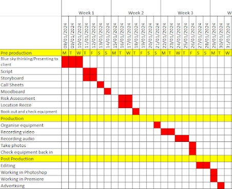
I was asked by Coca Cola LTD to create a healthy fizzy drink. I came up with a name for the drink and created the whole advertising campaign. I chose to make my healthy fizzy drink an energy drink to cater towards a more specific target audience. To ensure that I completed all of the tasks that I had been assigned by Coca Cola LTD in time, it was imperative that I created a project plan. A project plan is beneficial throughout the entirety of the pre-production, production and post production process of creating my advertisements, this is because it assists me with time management and scheduling the tasks I have to complete. I relied on the project plan I created to schedule and prioritise certain tasks over others and ultimately it helped me create the advertisements effectively and smoothly.
This is the project plan I created while in the pre-production phase of the project given to me by Coca Cola LTD. I followed these steps to ensure that each task was finished in the time slot given; this is so I do not fall behind on tasks and have to rush as I wanted each piece of work I created to be of the highest standard and professional.
I sorted each task I had to complete by whether it was a pre production task, production task, or post production task, I did this to optimise my efficiency, and I placed milestones on my project plan for when I completed one of these major stages because it meant that I can now move onto another stage of the production process. I believe that this is an example of how I conformed to the client brief because my project plan helped me complete all the tasks I was set and in an efficient manner.
Print Advertisement
This is my completed print advertisement that I created for my energy drink brand 'Lotus'. I believe that the advertisement I created on Adobe Photoshop meets the brief because of multiple different factors. Firstly, it is clear that I have created a print advertisement for a healthy and fizzy drink made up of natural ingredients. Additionally, my advertisement targets a specific audience which is mentioned in the brief. Coca Cola LTD want the target audience to be teenagers and young adults and they want the target audience to feature a culturally diverse range of people. Although I was granted some freedom with working around my target audience and the flavours I was able to choose for my energy drink, I still selected my target audience to be people aged 16 to 30, specifically females as my adverts feature a lot of colours generally liked by females like pink and purple. This is a prime example of how my advertisement fits the brief, as the target audience that my print advert caters towards is a valid target audience mentioned in the brief.Furthermore, my print advert meets the brief due to the standard of the advert itself. Firstly, all the images that have been implemented into my adverts are clear and not pixelated; I had to ensure that any images I use throughout my photoshop work were of a high quality otherwise this would hinder my brands success as people would not be willing to purchase from a brand that has an unprofessional looking advertising campaign. To add to this, I had to make certain that the advert I was creating was professional and I consider that it is, this is because all the aspects and key characteristics of the advert link together to create an advert that presents itself as a finished and polished advert and well thought about. An example of this is the usage of colour in my print ad, the colours of the text on the can match the colours of the text of my tagline, this makes my advert more detailed and subtle but noticeable aspects like this make my consumer believe my advert is professionally made.
My advert has bet the brief aesthetically due to the colours and imagery I used in my advert. The brief states that I need to create an advertising campaign for a new fizzy and healthy drink made up of natural ingredients; I believe that the aesthetics of my advert meet these requirements for a multitude of reasons. Firstly, the sunset imagery that I used in my adverts promotes healthiness and naturalness due to the fact that sunsets are natural daily occurrences that many people love to witness as they are deemed as pretty. This meets the brief because the use of beautiful and natural imagery conveys how the drink is healthy and made up of natural ingredients just as the client brief states. In addition, the colours I used (pink, orange, yellow and purple) help portray the healthy image outlined by the brief; this is because the usage of both pastel and vibrant tones portrays a friendly and tasty drink and not one that would harm you with its unhealthy ingredients like a can of Monster Energy does. Monster Energy promotes itself as a dark and powerful drink that will give you a boost however it seems unhealthy unlike my drink which combats this by using calm pastel colours and happy vibrant colours to connote healthiness.
Social Media Advertisement
This is my completed social media advertisement. I believe that this advertisement also meets the client brief given to me by Coca Cola LTD. I believe that my photoshop advert meets the client brief for a plethora of reasons, one of these reasons being that all my images are clear. I ensured that each image that I used in my adobe photoshop ad was clear to convey a professional and legitimate brand image, if I decided to use images that were not clear, my brand would look unpolished and unserious and Coca Cola LTD would not be satisfied with what I provided them with. Therefore I met the client brief by using clear images. Additionally, another reason I met the client brief is because my advertisements look professional due to how the aspects of the advert link together, when thinking of ideas for my advert I knew I had to make the key characteristics of the advert related to each other and that I couldn't just add a bunch of different design ideas that do not match together. That is why I chose the sunset imagery as well as the orange to purple gradient background to match with the sun graphic in the middle of my ad; these aspects of my advert link together to create a scenic sunset. I had to deliberately choose these colours to ensure that it portrays the natural tone that I desired for my social media advertisement.
Furthermore, the client brief states that it wants me to create a web advertisement for a new, healthy fizzy drink. I have clearly met this requirement in the brief due to the fact that I created a social media (web) advertisement for a fizzy energy drink that is healthy and made up of all natural ingredients. My energy drink is advertised as a healthy drink through the colours and imagery that I chose to utilise in my advertisements. The mixture of both vibrant tones and pastel tones creates a sweet, friendly and happy brand image; this helps my brand present itself as healthy because the friendly brand image convinces the consumers that it is a harmless drink that is beneficial to consume. The use of light green on my logo and on the can itself conveys the healthy and natural brand image I want to portray due to how green is a colour commonly associated with plants and health. Also, the target audience I chose to direct my advertisements towards meets the client brief. The client brief states that the drink must appeal to the younger generation and I met this requirement because my target audience is people aged 16-30, primarily female due to the colours I chose like pink and purple, which are commonly seen as feminine. To add to this, my target audience is also features a culturally diverse range of people as my advertising campaign is not targeted towards any specific ethnicity, religion or sexuality which helps me meet the brief outline by Coca Cola LTD as they asked me to feature a more diverse target audience instead of catering it completely to a small group of people.
Overall, I believe that the advertisement campaign that I have created meets the client brief, I believe that my finished products have met the brief due to the quality of the adverts and all the key aspects and characteristics I implemented into the adverts.


Comments
Post a Comment