M3
Codes and Conventions
Introduction
In this report I will discuss codes and conventions, specifically how my advertisements meet the codes and conventions and what I did to meet these necessary codes and conventions. Codes and conventions are a crucial part of advertisements and it is imperative that they are included in an advert to make it appeal to consumers.
Codes and Conventions
Codes and conventions that are commonly featured and associated with print advertisements are:
- A picture of the product
- A USP (Unique Selling Point)
- Lighting
- Setting / Colour scheme
- Logo / Brand name
- Slogan / Tagline
I believe that I have met these codes and conventions when creating both my print and social media advertisement.
Print Advertisement
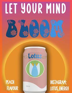
This is the final version of the print advertisement for my energy drink, Lotus. I believe that this advertisement includes the codes and conventions previously mentioned. Firstly, it is clear that there is a picture of the product in my print advertisement, evidently there is my Lotus energy drink can, in all its glory, in the centre of the advertisement. Furthermore, my logo and brand name are both on the can so whoever sees the print advert are aware of my brands logo and name in case they are interested in searching up more about my brand. I chose a very specific colour scheme for both my print and social media adverts, this was deliberate because I wanted to ensure that my advertisements were catered towards my desired target audience (Females aged 16-30) which is why I chose warm tones like pink, orange and purple for the majority of both the advertisements with a hint of colder tones like blue on the text layers and the can. I believe that these colours cater towards my desired target audience because they represent the sunset imagery I created for my adverts; this sunset imagery interests my target audience because sunsets are a natural and beautiful occurrence, and with it being a natural occurrence it helps establish that my drink is healthy and natural instead of filled with artificial flavouring and colours like a lot of other energy drinks on the market. Additionally, warmer colours like pink are usually associated with the female gender, therefore I utilised this colour by using it on my can and including it in my sunset background to attract a female audience.
Furthermore, my print advert meets the codes and conventions of a slogan / tagline because my advert features my brands slogan / tagline 'Let your mind bloom'. This is one of the main characteristics of the advert and is one of the first things that consumers would notice when they see my advert. I purposely made the decision to make my slogan so noticeable because it is a big part of my brand, this is because it promotes the flowery imagery my brand has, as lotus flowers are featured in the name and logo and so a tagline which continues this flower theme is imperative to make my brand look professional. I used the code and convention of lighting to portray my scenic sunset background, while editing on Adobe Photoshop I added lighting effects such as drop shadows and outer glows to create the sunset effect and make it more realistic and more detailed.
The unique selling point of my energy drink Lotus is that it is a healthier alternative to the more popular energy drinks on the current market like Red Bull, Monster and Rockstar. The fact that my product appeals to a different audience to the majority of existing energy drink products makes my drink individual and distinctive. Many people deliberately stay away from energy drinks and refuse to purchase them because of how the majority of energy drinks are sugary or have artificial sweeteners, my brand combats this by providing a healthier alternative, therefore making my brand have a unique selling point which sets it apart from the rest.
Social Media Advertisement
This is the final version of the social media (Instagram) advertisement. I believe that this advertisement also includes the codes and conventions like my print advert. Firstly, there is a clear picture of the product in the advertisement, in this advert there are three different variations of my product as this advert showcases to the consumers the different flavours of Lotus energy there is. Because one of the purposes of this advert is to advertise the different flavours it is imperative that the different flavoured cans are presented and are a key characteristic of the ad therefore I implemented each can clearly. Furthermore, the tagline / slogan is a code and convention that I included in my advert. The tagline / slogan is a key characteristic of my advert however it does not take up as much space in my social media advert compared to my print advert. This is because this advert focuses more on the separate flavours of my drink, although the tagline is still relevant and clear to see; I want the consumers to pay attention to both the different drink cans and the tagline therefore I limited the size of the text for the tagline so that it doesn't distract from the cans. My social media advert contains the same colour scheme as my print ad however I did not use the same editing techniques and effects on my social media advert because I wanted the colours to be more pastel and less harsh on this advert to compliment the cans more and to highlight the cans instead of overshadowing them. The pastel pink and orange colour scheme caters towards my target audience and therefore it is important that I implement this code and convention into my advert to help interest my target audience. Due to the colour scheme being more pastel and light on this advert, it results in the same effect for the lighting; the outer glow and drop shadow effects are still edited onto this advert however they are slightly less noticeable on this ad due to the tones being more calm.
The logo and brand name are featured more than once on this advert due to each can having the Lotus brand name and logo on the design. This means that anybody that comes across the advert on social media will be made aware of the brand. Finally, the unique selling point in my social media advertisement is the fact that my advert is very distinctive compared to other energy drink ads. Most energy drink advertisements use dark or vibrant colours, however mine uses pastel and warm tones to create a natural and healthy tone.


Comments
Post a Comment